
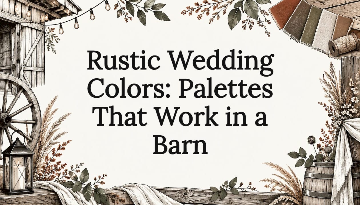
The best rustic wedding colors are earthy, softened shades (sage, terracotta, dusty blue, burgundy, cream) kept to two or three main hues and chosen to sit comfortably against your venue's wood, light and landscape. Start with the barn, not a Pinterest board. When we walk couples through our barn at Origins Ranch in Plant City, the palette that photographs best is nearly always the one that borrows from the space instead of fighting it.
Below you will find palettes sorted by season, a simple rule for balancing them, and the testing steps that keep a lovely swatch from turning into a surprise on the day.
TL;DR
- Limit your scheme to two or three main colors and let greenery and wood do the rest.
- Use the 60/30/10 rule: a dominant color, a supporting color, and a small metallic or accent finish.
- Match the palette to your date: sage and terracotta for spring and summer, deep green, rust and gold or burgundy and copper for fall.
- Test fabric swatches inside the barn, in daylight and in evening light, before you order anything.
- Ask your florist what will be in season on your date before you fall in love with a shade.
Table of Contents
- What makes a color "rustic"
- Start with the barn, not the swatch book
- Rustic wedding color palettes by season
- A quick palette chooser
- Make it cohesive: the 60/30/10 rule
- Coordinate flowers, attire and food
- Test before you commit
- Our perspective on barn wedding colors
- See your palette in the barn
- FAQ
- Sources
What makes a color "rustic"
Rustic color is natural color. Think of what you see on a farm: weathered gray boards, honey-colored pine, dried grasses, sage-green leaves, clay and rust. Rustic palettes take those shades and soften them, so a bright red becomes brick or burgundy, a sky blue becomes dusty blue, and a stark white becomes cream or ivory.
That is why the same handful of colors keeps appearing in rustic and barn palettes. One barn-wedding guide names eight staples: sage green, dusty blue, warm beige, terracotta, dusty rose, olive green, soft ivory and weathered gray. You can build almost any rustic scheme from that list.
Rustic does not mean dull. Planner Tara Federico describes a rose gold, blush and white palette as romantic-rustic with a level of softness, proof that soft, traditional colors with a touch of metallic can sit happily in a barn.
Start with the barn, not the swatch book
The most useful advice we can give is to take your colors from the space. Planner Ashley Mason of Saunter Weddings advises couples to work in partnership with what is around the space. A greenery arch in front of a forest of green trees, for example, can cancel itself out.
A simple four-step method from a wedding decor retailer works well for barns: look at the colors already in the venue, choose a favorite shade, add a lighter neutral and supporting shades, then compare samples. For a barn or estate it suggests terracotta, olive, sage, ivory and warm sand.
Wood matters more than people expect. Weathered gray boards and honey-colored pine change how a color reads, so test fabric swatches against the barn's own boards rather than against white paper or a phone screen.

Rustic wedding color palettes by season
Your date narrows the field faster than any other choice. Fall is the busiest rustic season, because harvest colors, cooler temperatures and golden light line up. Here is how the palettes break down.
Spring and summer
Lighter, fresher mixes suit warm months:
- Sage, cream and terracotta: a reliable late spring and summer scheme for barns and farms, according to WeddingDay Magazine.
- Barn White: warm white, sage, natural wood and soft blush, suggested for spring and summer.
- Summer Farm: sunflower yellow, lavender, light blue and ivory, from the same guide, for a sunny, field-inspired look.
- Blush and sage: a pairing recommended for spring or summer meadow and barn weddings.
- Coral, ivory and champagne, or terracotta, warm white and olive: two of the summer palettes in a US seasonal guide.
Don't assume saffron and burgundy are only for autumn. Both can work equally well for a late summer rustic wedding on a ranch or in a red wooden farmhouse.
Fall and early winter
Deeper, warmer colors take over:
- Deep green, rust and gold: a dependable fall palette for barns.
- Burgundy, blush and copper: well suited to late fall and early winter.
- Terracotta, rust and sage: a combination that suits October ceremonies across the US South and Midwest.
- Moody Vineyard: burgundy, forest green, dusty mauve and pewter, mapped to fall and winter.
- Harvest Barn: rust, terracotta, straw gold and cream, one of the barn-specific fall palettes with hex codes. The same guide's Tobacco Road palette (walnut, pecan, caramel and parchment) gives you a fall barn scheme without orange.
We go deeper on this season in our guide to fall wedding colors that suit a barn.
Cooler tones for any season
If warm oranges are not your style, navy, dusty blue and lavender with greenery is a calm option, and navy with sage works well for cooler months. For a modern farmhouse look, black, white and natural wood is the clean, graphic choice. Wedgewood blue and burgundy balanced with a soft neutral like sandstone is another combination planners call refined but still approachable.
A quick palette chooser
| Palette | Best season | Mood | Natural pairing |
|---|---|---|---|
| Sage, cream, terracotta | Late spring, summer | Fresh, earthy | Raw wood, eucalyptus |
| Dusty blue, navy, lavender | Spring through fall | Calm, classic | Greenery, weathered gray boards |
| Deep green, rust, gold | Fall | Warm, abundant | Dried grasses, brass |
| Burgundy, blush, copper | Late fall, early winter | Romantic, rich | Velvet, candlelight |
| Black, white, natural wood | Any | Modern farmhouse | Linen, black metal |
| Sunflower yellow, lavender, ivory | Summer | Sunny, playful | Wildflowers, mason jars |
Make it cohesive: the 60/30/10 rule
Picking colors is easy. Balancing them is where couples get stuck. Event planners use the 60/30/10 rule: the dominant color covers large surfaces like drapery, table linen or flowers (60%), a complementary color adds texture and layers (30%), and a 10% accent, often gold, copper or rose gold, finishes the scheme.

The proportions change how a palette feels. A decor expert points out that ivory tablecloths with burgundy napkins feel much lighter than burgundy tablecloths with ivory napkins, even though the colors are identical.
A worked example for a fall barn wedding:
- 60%, cream and warm ivory: table linens, ceremony drapery, most of the flowers.
- 30%, burgundy and terracotta: napkins, bridesmaid dresses, bouquets, a few centerpiece blooms.
- 10%, brass or copper: candlesticks, flatware, signage frames.
One more helpful guideline: a common rustic formula is a base neutral, two complementary tones and one accent, three to five shades in total. Texture does a lot of the work, so wood slabs, linen runners, dried florals and pampas grass add richness without adding more colors.
If you want more ways to bring these shades to life in the room, our barn wedding decor guide and rustic table settings tips walk through linens, centerpieces and place settings.
Coordinate flowers, attire and food
Flowers
Natural flowers don't need to match a hex code. Show your florist the overall color range and the shades to avoid, and let them work with what is fresh. A floral team recommends two bold main colors and one neutral, such as terracotta and burgundy with ivory, with ivory roses or ranunculus for lightness and eucalyptus or olive branches as the unifying greenery.
Season matters. Peonies bloom in late spring, sunflowers and zinnias in summer, and dahlias and mums from late summer into fall, so settle your date before choosing a palette that won't be in bloom. Confirm your key stems with the florist four to six months out.
Bridesmaids and groomsmen
Mismatched bridesmaid dresses in different shades of one palette color (all sage, all dusty rose, all warm brown) look relaxed and natural in a barn. For suits, linen or light wool in navy, gray or earthy tan fits the setting. A bridesmaid-dress guide recommends barn palettes of terracotta, olive, rust and taupe, and advises avoiding bright jewel tones that clash with wood.
Whatever you choose, check dress swatches in natural light and against several skin tones.
Food and drinks
Color does not stop at the tablecloth. Your menu, dessert table and signature drinks are part of the picture, and a tray of fruit or a colorful salad can repeat your accent shade beautifully. For plating inspiration, these vibrant food presentation examples show how bright ingredients can carry a palette. For menus that suit a farm setting, see our rustic wedding menu ideas.
Test before you commit
A shade that looks perfect on a screen can read very differently in a real room. Martha Stewart's team notes that a color can look different under warm candlelight or outdoor sun, so test across stationery, florals, attire and lighting.
A practical checklist:
- Ask for physical swatches. Phone screens distort color, and vendors can send real fabric samples.
- Hold them in the venue. View them at the same time of day as your ceremony and again under the evening lights.
- Watch warm light. Candlelight and warm bulbs amplify orange, rust and gold and mute cool tones, and sage can photograph olive-yellow.
- Don't overdo saturation. One or two bold shades balanced by neutrals will look calmer than five strong colors.
- Coordinate, don't match. Flowers, dresses and linens should feel related, not identical.
If you are planning an outdoor ceremony in Florida, the weather window matters too. A local seasonal guide says the mildest months for an outdoor wedding run roughly from November to April, with heat and humidity intense in the summer months. That is worth knowing when you pick between light summer linens and heavier fall velvet.
Our perspective on barn wedding colors
At Origins Ranch we started with sugar sand and a barn that was once a World Champion Horse Ranch. We kept the charm of that barn and made it modern and elegant, and that history shapes how we talk to couples about color.
Our advice is simple: let the barn lead. Warm wood, open space and a country setting already give you a beautiful backdrop, so your colors only need to add the story that is yours. Two or three main shades, a little texture and one metallic usually say more than a crowded palette.
We also love that couples can enjoy all of this in comfort. Ours is a fully air-conditioned large barn, so your linens, florals and formal attire stay fresh through a Florida celebration, and our customizable in-house table settings and decor let you bring your palette to life without sourcing everything yourself.
Whether it is a rustic wedding, a quinceañera or a Weddings For Warriors celebration for a veteran or active duty service member, we give every event personal attention. Where our ranch is your ranch, your colors should feel like you.
Origins
See your palette in the barn
Colors are easier to choose when you can stand in the room. Origins Ranch in Plant City offers venue-only and all-inclusive wedding packages, indoor and outdoor ceremony spaces, customizable in-house table settings and decor, onsite catering options and on-site lodging for guests. Pricing is not published online, so ask us about your date and guest count.
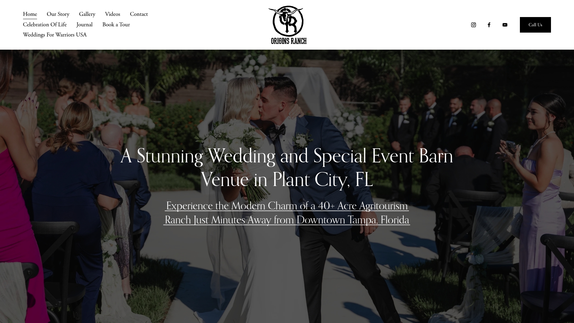
Browse our gallery to see how different palettes look against our barn, and if you are planning a quinceañera, our quinceañera packages are designed for that celebration. For more ideas on personal touches, read how to personalize a barn wedding.
FAQ
How many colors should a rustic wedding palette have?
Two or three main colors is the sweet spot, with a neutral and a metallic accent as support. Most rustic guides suggest three to five shades in total: a base neutral, two complementary tones and one accent. Greenery and wood supply the rest of the color for free.
What are the best rustic wedding colors for a barn?
Sage green, dusty blue, terracotta, dusty rose, olive, ivory, warm beige and weathered gray are the most-used barn shades. Pair them so one is dominant: sage with terracotta, navy with dusty blue, or burgundy with blush. Then check them against the barn's wood tones in person.
What are good fall colors for a rustic wedding?
Burgundy, terracotta, rust, deep green, plum, mustard and gold are the anchors. Combinations such as deep green, rust and gold or burgundy, copper and cream are common fall choices. Add dried grasses, raw wood and linen so the colors feel grounded.
Can a rustic wedding still feel elegant?
Yes. Soften the palette, add metallics like gold, copper or rose gold, and use linen, velvet or lace for texture. Planners describe blush, rose gold and white as romantic-rustic, which shows that polish and a barn setting go together.
When should I lock in my colors?
Choose them after you have your date and venue, since both decide which flowers and lighting you will have. Then order swatches, test them in the space and share the final range with your florist several months ahead.
Sources
- 30 Rustic Wedding Ideas for Barn and Farm Weddings (WeddingDay Magazine)
- The Best Color Palettes for a Rustic Wedding (Brides)
- 20+ Barn Wedding Color Palettes (Matched Hearts)
- How to Choose Wedding Colors: 4 Steps for Your Venue (WeddingDecor.com)
- Rustic Wedding Ideas 2026 (Paperlust)
- Wedding Colour Schemes for Every Season (Paperlust)
- 70+ Rustic Wedding Ideas (Minted)
- 10 Best Colors For a Summer Rustic Wedding (Outlinist)
- Fall Wedding Color Palettes 2026 (Pix Wedding)
- Fall Wedding Colors 2026 (Pix Wedding)
- The 60/30/10 Rule for Wedding Colors (Howerton+Wooten Events)
- Choosing the Perfect Rustic Wedding Color Palette (Tiny Luxe Weddings)
- Terracotta, Rust & Burgundy Wedding Flowers (Whole Blossoms)
- Choose Bridesmaid Dresses for Your Wedding Color Theme (Azazie)
- 50 Wedding Color Schemes (Martha Stewart)
- Say "I Do" Outdoors in Florida: A Seasonal Wedding Guide
- Vibrant Food Presentations: 10 Examples That Inspire